How to Use the Authority Map
How to read all five tabs: what the value figures estimate, what counts as captured, and how the Gaps matrix picks your next article.
Updated Sep 9, 2026 · 12 min read
Everyone opens the Authority Map looking for the same thing: a list of what to write. It has one, but it also has something more useful, which is a number telling you what each item on the list is actually worth.
This page is about reading those numbers.
Five tabs, five different questions. Two of them (Value map and Gaps) do arithmetic that nobody explains anywhere else, so most of this page lives there.
If you have not built a map yet, or you want to know how the pillars and clusters get decided in the first place, start at Topical Map. This page assumes the map exists and picks up from there.
The five tabs, in one breath
They live under Authority Map in the sidebar, and each one carries its own URL, so you can bookmark the view you actually use.
- Value map (?tab=value) - the money view, and the default. What the niche is worth, what you have taken, and what to queue next.
- Board (?tab=board) - the structure. Pillars as columns, cluster cards underneath, coverage percentages.
- Gaps (?tab=gaps) - coverage by pillar and by intent. The amber number on the tab is how many articles are missing.
- Keywords (?tab=keywords) - the full sortable table, where you add, import and refresh.
- Calendar (?tab=calendar) - scheduled keywords by date, drag and drop.
Board, Keywords and Calendar are covered properly on Topical Map and Auto Scheduling. The rest of this page is the two that are not.
Value map: what the niche is worth
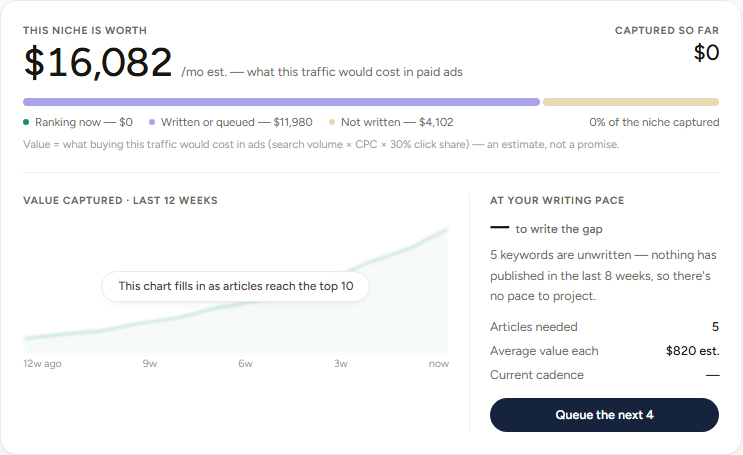
The big number is what buying this traffic would cost you in Google Ads. Not what you will earn, not what you will make. What the ads would cost.
Here is the whole calculation, and it is deliberately simple:
monthly search volume × cost per click × 30% click share
Volume and cost per click come from Google Ads data. The 30% is a flat assumption about how much of a keyword's traffic a top result takes, applied identically to every keyword, whether you would land at position 1 or position 9.
Treat these figures as a ranking device, not a forecast. A flat 30% click share is generous for position 8 and stingy for position 1, real click-through rates swing wildly by query type, and a keyword nobody bids on returns a cost per click of zero and therefore a value of zero. The numbers are excellent for sorting one cluster against another. They are not a revenue projection, and the app says so on the panel itself.
Captured, pipeline, unwritten
The three-colour bar is the part worth understanding, because the buckets are stricter than they look.
- Ranking now - the keyword has an article, that article is published, and its most recent rank check put it in the top 10. Nothing else counts as captured.
- Written or queued - an article exists in any state, or the keyword is queued and waiting its turn. A published article sitting at position 14 lives here, not in the green.
- Not written - no article, no queue slot. This is the backlog.
That middle bucket is where most sites keep most of their value for the first few months, and it is the honest place for it to sit. Writing is not capturing.
One layout detail that confuses people: on a brand new site the headline figure is This niche is worth with a small Captured so far in the corner. The moment you capture anything, the two swap, and the big number becomes what you have taken while the corner shows what is still on the table.
The 12-week trend
The chart plots one point per week for twelve Monday-start weeks, and each point is the total value of every keyword that was ranking in the top 10 as of that week.
Two things about it are worth knowing.
It uses the last known rank check and carries it forward, so a keyword that was checked three weeks ago keeps counting at that position until a newer check replaces it. And every week is priced at today's volume and cost per click, so the line reflects ranking movement only, never a change in what the keyword is worth.
Before anything of yours reaches the top 10, the chart shows a blurred illustrative curve behind the label This chart fills in as articles reach the top 10. That shape is decoration, not your data, and it is deliberately blurred so you do not mistake it for a result.
The green percentage chip beside the heading compares now against four weeks ago. It stays hidden until there was something to compare against, so a new site sees no chip rather than a meaningless +100%.
At your writing pace
This is the most honest panel in the product, and the one people skip.
It takes how many articles you actually published in the last eight weeks, divides by eight, and tells you how many weeks it will take to clear the unwritten backlog at that rate. Not your intended rate. The measured one.
If you have published nothing in eight weeks it refuses to guess, and says so: nothing has published in the last 8 weeks, so there's no pace to project. Three stats sit underneath: Articles needed, Average value each, and Current cadence in articles per week.
Below them is Queue the next with a number attached. That number is roughly a tenth of your plan's monthly article allowance, so one click can never burn a whole month.
| Plan | Articles per month | Queue button size |
|---|---|---|
| Trial | 2 total | 1 |
| Starter | 30 | 3 |
| Growth | 50 | 5 |
| Portfolio | 100 | 10 |
| Agency | 220 | 10 |
Clicking it starts the top keyword writing immediately and drips the rest onto the Calendar, one per day. You get a toast reading First article started with a View calendar link.
Where the value sits
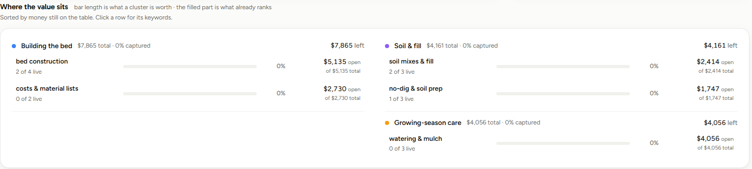
Clusters, sorted by money still on the table rather than by size. That sort is the point: a big cluster you already own ranks below a medium one you have not touched, which is exactly the order you would write them in.
Each row gives you the cluster name, N of M live, a bar filled to whatever share is ranking, and the open value against the total. An amber N to refresh chip means that many of the cluster's articles are sitting at positions 11 to 20, which is the band where a rewrite pays better than a new article.
Click any row and a drawer opens with the individual keywords.
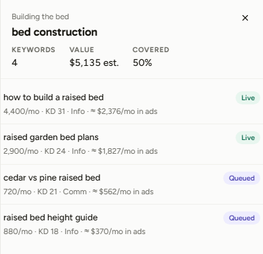
Chips read Live, Queued or Not written, and a ranking keyword shows its position number instead of a word. If anything in the cluster is unwritten, a Queue button appears at the bottom, capped at three regardless of your plan.
If you have keywords sitting outside any cluster, a footnote at the bottom counts them and prices them. They do not appear in this view, or in Gaps, until you assign them on the Board.
Gaps: the tab nobody finds in week one
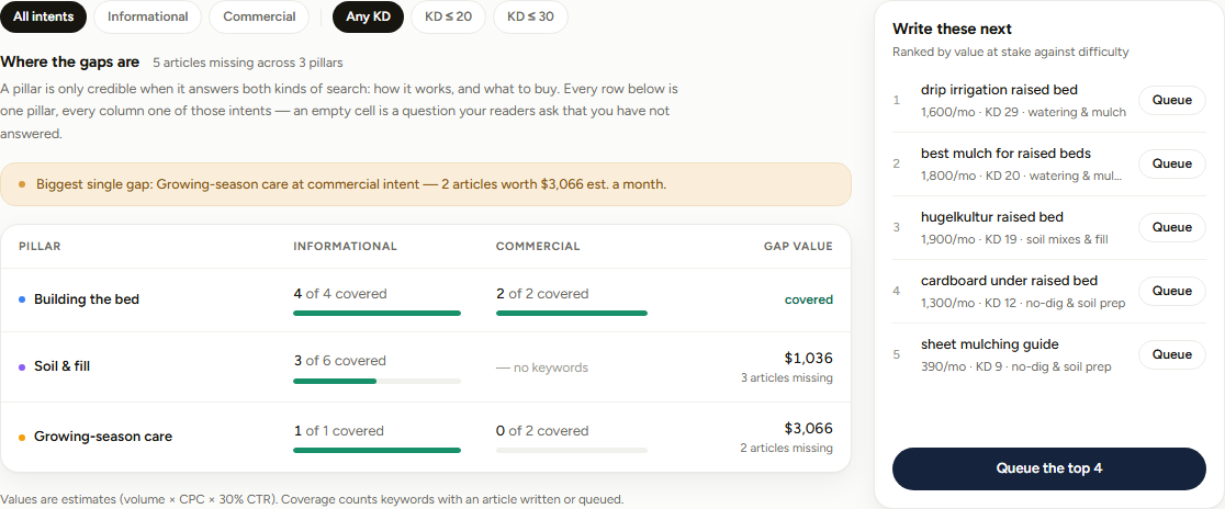
Every pillar becomes a row. Every row splits into two columns: Informational and Commercial.
The logic behind the split is the whole argument for the tab. A pillar with fifteen how-to guides and nothing commercial reads to a search engine as a hobby blog, and a pillar with only buying guides reads as a catalogue. Credibility comes from answering both kinds of question, and this table shows you which half you are missing.
How the cells read
A cell shows N of M covered with a small bar, or no keywords when the pillar has nothing at that intent. The fourth column, Gap value, shows either a green covered or a dollar figure above N articles missing.
Covered here means written or queued, not ranking. This is looser than the Value map's definition on purpose: Gaps is about whether the question has an answer, not whether the answer won yet.
A pillar with no keywords at all reads as covered. Nothing is missing because nothing exists, so the row goes green. If you see a pillar you know is empty showing as covered, that is what happened. Fill it on the Board, then come back.
Above the table, an amber line names your single biggest gap: which pillar, which intent, how many articles, and what they are worth per month. That one line is a decent weekly to-do list on its own.
The filters do less than they look like they do
The chips across the top (All intents, Informational, Commercial, then Any KD, KD ≤ 20, KD ≤ 30) change the Write these next rail on the right. They do not change the matrix.
That is worth saying twice, because it looks like a table filter and it is not. Set KD ≤ 20 and the pillar rows stay identical while the rail on the right reshuffles into easy wins.
One quiet catch: a keyword with no difficulty data is dropped by either KD filter. If the rail suddenly looks thin, switch back to Any KD and see whether the keywords reappear.
Write these next
Up to seven keywords, ranked by value at stake and then by whichever is easier. Each row carries its own Queue button, and the footer button queues the whole filtered batch at your plan's size.
Keywords that belong to no cluster show up here labelled Unassigned, which makes this rail the only place in the tab where they appear at all.
Where intent comes from
Intent is not a guess made by a model. It arrives with the keyword data from the search provider, and gets folded into two buckets: anything marked transactional or commercial becomes Commercial, and everything else, including navigational and anything unclassified, becomes Informational.
So Informational is the catch-all. If a keyword you think of as a buying term sits in the wrong column, that is the fold-down doing it, not a judgement about your niche.
Getting the most out of it
Read the pace panel before you read anything else on a Monday. It is the only number on the page that describes you rather than the market. If Current cadence reads 0.5 and the gap needs sixteen weeks, no amount of clever keyword selection fixes that, and the honest move is to queue a bigger batch rather than re-sorting the same backlog.
Work the Gaps rail, not the Board's biggest cluster. Open Gaps, set KD ≤ 20, and queue the top batch. Those keywords are chosen by value against difficulty and they land in pillars that already have some coverage, which is why they tend to reach the top 30 faster than the fat head term you were eyeing. Try it for one month and compare against a month of hand-picking.
Chase the amber to refresh chips before you write anything new. An article at position 14 needs maybe an hour of added depth to reach the top 10, where it starts counting toward captured value. A new article needs eight weeks and a lot of luck. When a cluster shows 2 to refresh, that is two of the cheapest wins available to you this week.
Fix your commercial column in the pillar that already has the most informational coverage. Not the emptiest pillar, the most credible one. Search engines already trust you there, so the buying-intent article inherits that trust instead of starting from scratch.
Ignore the captured figure for the first eight weeks. It will read $0 and it is supposed to. Nothing ranks in the top 10 that fast. Watch the Written or queued segment grow instead, because that is the part you actually control, and the green follows it by a quarter.
Sanity-check one value figure by hand before you trust the sort. Open the cluster drawer, take the top keyword, multiply its monthly volume by its cost per click by 0.3, and confirm you get the number shown. Doing this once turns the dollar signs from magic into arithmetic, and you will use them with better judgement afterwards.
It is working when the Gaps table shows covered in a row that used to show a dollar figure, the pace panel's cadence has stopped reading a dash, and the 12-week chart has dropped its blurred preview curve for a real line.
Troubleshooting
- Captured is $0 but I have published plenty. Captured counts only published articles whose latest rank check landed in the top 10. Everything else is pipeline. Check Rank Tracking: if no checks have run yet, there is no position to grade against.
- A cluster shows $0 value even though it has real keywords. Cost per click is missing, which happens on terms nobody bids on, and the formula multiplies by zero. It usually signals low commercial competition rather than no traffic, and those keywords are often easy wins. Run Refresh Data on the Keywords tab if the whole table looks blank.
- The 12-week chart is blurred with a pill over it. Nothing of yours has reached the top 10 yet, so there is nothing to plot. The curve behind the pill is illustrative, not your data.
- A KD filter emptied the Write these next rail. Keywords without difficulty data are excluded by any KD filter. Switch to Any KD to see them again.
- A pillar shows covered but I know it is empty. An empty pillar has nothing missing, so the row reads green. Add keywords to its clusters on the Board.
- Keywords are missing from Gaps entirely. The matrix only counts keywords assigned to a cluster. Unassigned ones show only in Write these next, labelled Unassigned. Use Auto-assign on the Board to sort them.
The map does not tell you what to write. It tells you what writing is worth, which is a harder question and a much more useful answer.
Was this page useful?
Tell us what was missing and we'll fix the page.