Writing Effective Image Prompts
What makes a style prompt work, how to match a brand look, when a reference image beats words, and the two failures that show up across a whole blog.
Updated Aug 26, 2026 · 8 min read
Nobody reads your header image. They do, however, decide something about your site in the quarter second before they start reading, and forty articles with mismatched artwork make that decision for them.
Image style is the cheapest consistency you can buy. You set it once, in one field, and every article afterwards inherits it.
This page covers what a style prompt is actually doing, the five things a good one specifies, when to hand over a reference image instead, and the two failure modes that only become visible once you have a blog full of them.
You are writing half a prompt, and only half
Understanding this saves most of the trouble people have here.
The full prompt sent to the image model is assembled for you. The subject comes from the article's keyword, plus the section heading for the two in-body images, and your style text is appended at the end after the word Style. It looks roughly like this:
Create an editorial image for a blog article about: site diary software for builders.
Section topic: Recording variations on site.
Style: your text goes here.
Your style prompt should contain no subject matter at all. It describes how things look, never what they are, because the what is already handled and changes with every article.
The most common mistake: writing a style prompt like "construction workers on a building site with tablets, modern and professional". That subject fights the article's actual subject on every single image, and you get hard hats on your pricing-strategy post. Describe the medium and the palette. Let the keyword supply the scene.
The five slots a good style prompt fills
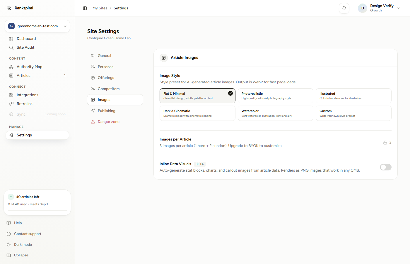
The presets in Settings → Images are worth reading before you write your own, because each one is a working example of the pattern. Flat & Minimal, for instance, resolves to this behind the scenes:
flat design illustration, minimal, professional, subtle muted color palette, clean geometric shapes, no text or words, white background
Seven clauses, no nouns from any particular article, and one exclusion. Copy that shape. The five slots to fill, in the order they matter:
- Medium - the single most important clause. flat vector illustration, editorial photograph, isometric 3D render, ink line drawing with flat colour fills. Vague here and everything downstream drifts.
- Palette - name colours, do not describe moods. deep navy, warm sand, single coral accent beats professional colour scheme by a wide margin.
- Lighting or finish - soft even lighting, no harsh shadows, or high contrast with a single light source. This is what makes a set of images look like one set.
- Composition - generous negative space, single central subject, clean white background. Also where you keep images from being visually noisy behind a title overlay.
- Exclusions - always at least no text or words. More on why below.
Aim for about 15 to 30 words across those five slots. Under ten and the model improvises. Past about forty and later clauses start getting ignored, which produces the maddening situation where the prompt keeps growing and the images keep looking the same.
Start here if you have no idea: pick Flat & Minimal and generate three articles before touching anything. It is the preset that fails most gracefully across unrelated topics, and three real images tell you more about what you want than an hour of writing prompts.
Matching a brand look
If you have a brand palette, this is a twenty-minute job that pays out on every article forever.
Get the hex codes and the names in front of you, then write the palette clause in plain colour words rather than hex, because plain words survive the trip better. "Deep teal and off-white with a single amber accent" is more reliable than pasting three hex values.
Then add one clause about what your brand never does visually. Every brand has one.
- Do - name two dominant colours and one accent, at most. Three-colour systems reproduce. Six-colour systems do not.
- Do - state the background explicitly. Clean white background or solid deep navy background. Left unsaid, backgrounds wander.
- Don't - use brand adjectives from your marketing deck. Bold, human, innovative means nothing to an image model.
- Don't - specify your logo. It will not be reproduced correctly and asking for it invites text into the image.
When to use a reference image instead of words
Sometimes you know the look and cannot describe it. Select Custom and use the Style Reference Image box instead.
Drop in one image and RankSpiral looks at it and writes the style description for you, in 50 to 80 words, covering medium, palette, lighting, mood, texture and composition. It deliberately ignores the subject matter of the image you uploaded, which is exactly what you want.
Use a reference image when:
- You have an existing brand illustration set and want new images to sit beside it. Upload one of the good ones.
- The look is specific and hard to name - a particular grain, a particular flatness, a particular way the shadows fall.
- You keep writing prompts and none of them land. One picture ends the argument.
Use words instead when the look is simple and you can name it in a sentence, or when you want tight control over the palette. A reference image gives you the whole look including parts you may not have meant to copy.
How the two combine: once a reference image is uploaded, the field below it becomes Style Notes (optional), and whatever you type there is appended after the extracted description. That is the best of both. Upload the reference for the look, then add clean white background, no text or words to lock down the parts you care about.
Practical constraints: any image format, under 5 MB, and one reference per site. Uploading a new one replaces the old. The description is read once and cached, so changing the reference is what changes future images, not regenerating them one at a time.
The two failures that only show up at scale
Text in images. Image models still try to render lettering, and they still get it wrong, so a hero image with garbled pseudo-words on it is a real risk. There is no separate "negative prompt" field to protect you. The words no text or words are baked into every built-in preset for exactly this reason, and if you write a custom prompt, that phrase is your responsibility. Put it in. Every time.
Style drift across articles. Twenty articles, twenty slightly different looks, nothing obviously broken. The cause is almost always an underspecified prompt: no medium clause, no background clause, and no palette. The model fills the gaps differently each time because the subject changes each time.
Two related things worth knowing so you do not chase them:
- Hero and section images are the same size, 1536 by 1024, and are generated by the same prompt with a section-topic line added. If you want the hero to look different from the in-body images, that is not currently something you can set.
- If image generation fails, a stock photo is used instead. That is the honest explanation for the one article in twenty whose header does not match the rest. It is a fallback, not a style change.
A worked example
A SaaS selling site diary and safety compliance software to mid-sized construction firms. Brand palette: charcoal, concrete grey, and a single safety-orange accent.
Their first custom prompt was this:
Professional construction industry imagery, modern and trustworthy, showing builders and site managers using technology on site. Brand colours.
Every image came back as a stock-photo pastiche of men in hi-vis holding tablets, including on an article about invoicing. Nothing matched anything else, and two of them had signage in them with invented words on the boards.
Three edits fixed it. Subject nouns out, medium in, exclusions added:
Isometric 3D illustration, matte finish, charcoal and concrete grey with a single safety-orange accent, soft even lighting, generous negative space, clean off-white background, no text or words.
Twenty-six words, zero nouns about construction, five slots filled.
The next eight articles came back looking like one set. The invoicing article got an isometric document flow in the same palette instead of a man in a hard hat, which is both more relevant and more obviously theirs.
They kept one extra clause from the earlier attempt and it earned its place: matte finish. It was the single word that stopped the renders looking glossy and generic, and it is the kind of thing you only discover by looking at three real images.
You have it right when you can open five articles from five different clusters and the images look like they came from the same design system, without any of them showing the same object twice.
Limits worth knowing before you plan around them
- Three images per article - one hero and two inside sections, evenly distributed. The count is fixed for most plans.
- Custom style and reference images need Growth or above. On Starter you get the five presets, which are genuinely good.
- Alt text is written for you, capped at 125 characters, and told never to open with "Image of" or "Photo of".
- Output is WebP, which is the right call for page speed and worth knowing if your CMS theme does anything unusual with image formats.
- Inline Data Visuals is a separate feature and the only one that puts real text into a graphic. Stat blocks and charts are rendered rather than generated, so the text is correct. It is in beta and off by default.
A good style prompt describes a look, not a scene.
Get that one distinction right and everything else on this page is a refinement.
Was this page useful?
Tell us what was missing and we'll fix the page.